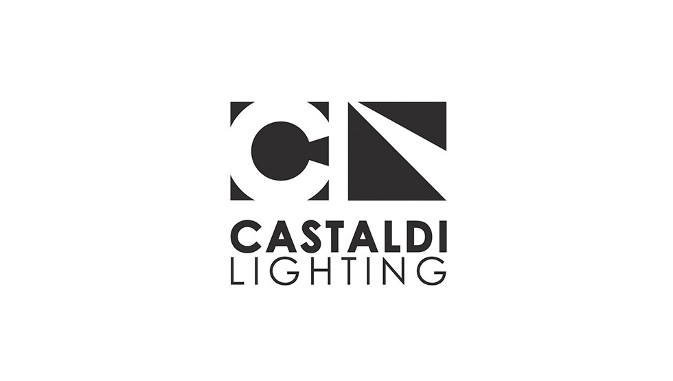
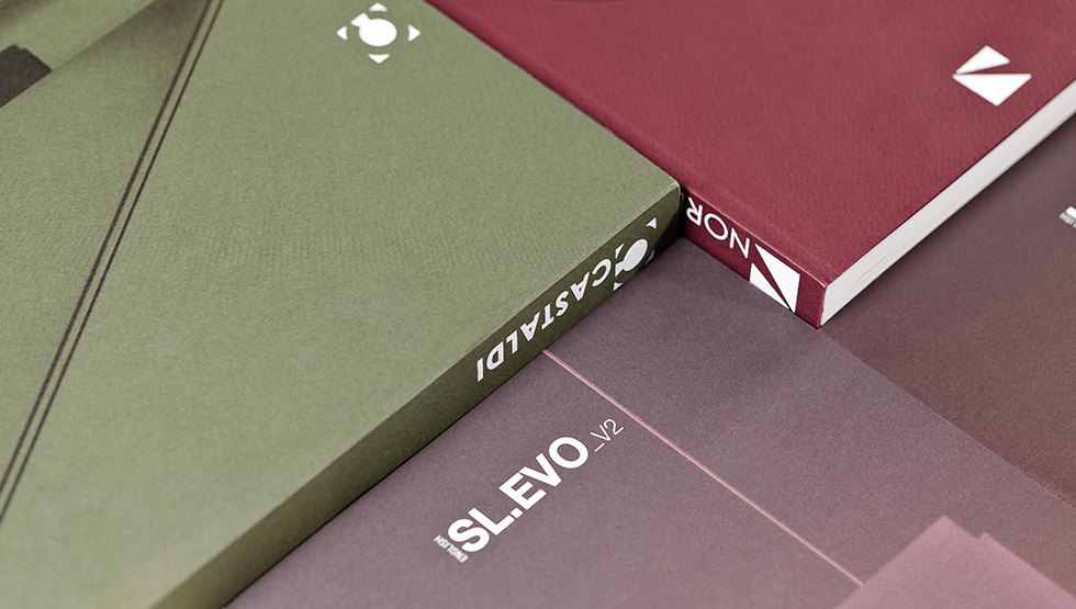
The rebranding of the new Castaldi Lighting group is founded on a revisitation of the brands of the two companies involved in the merger: Castaldi and Norlight. The procedure aimed to objectify the two pictograms to increase geometric clarity and power, and to reduce the symbolic value associated with an industrial past. The two geometric items merge to become a new symbolic sign and promote the new company’s merchandise.
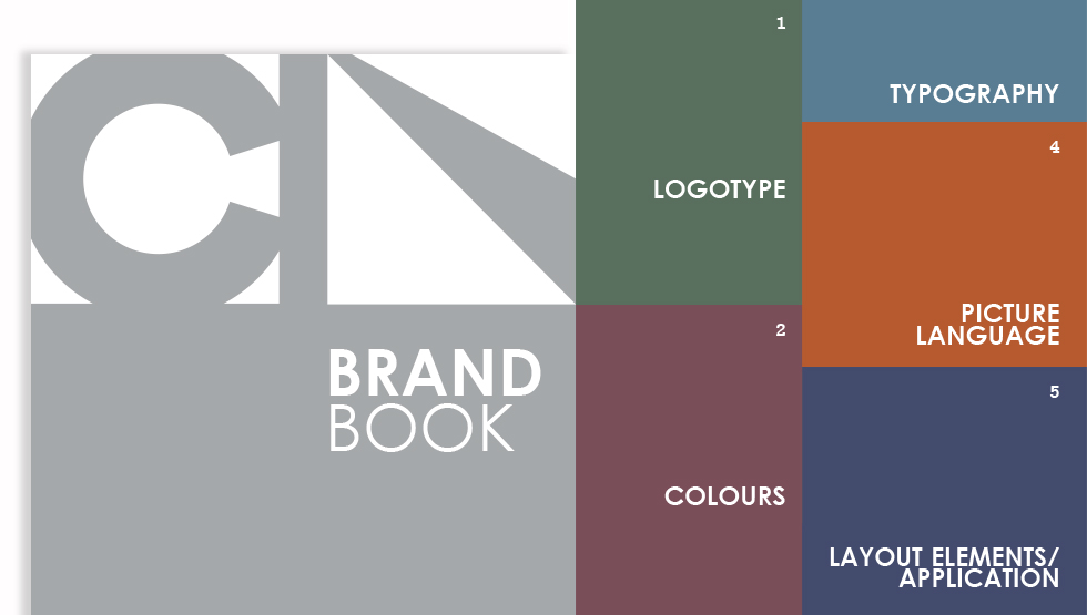
The two basic colors chosen are complementary:
A dull moss green and a rich deep maroon. They represent the two industrial faces, Castaldi and Norlight, which make up the new group with a new image and productive attitude. The new shade of green is a variation of the traditional Castaldi colors, but remains closely aligned with its production of outdoor lighting. The maroon is a new take on the traditional shade of orange used by Norlight to standardize the target for the communication.
Development of corporate identity for Castaldi Lighting (logo, business cards, letterhead, press kit). The group includes two brands of lighting:
Castaldi and Norlight. The project underlines the value of the new brand, Castaldi Lighting, born from the merger of Castaldi and Norlight.
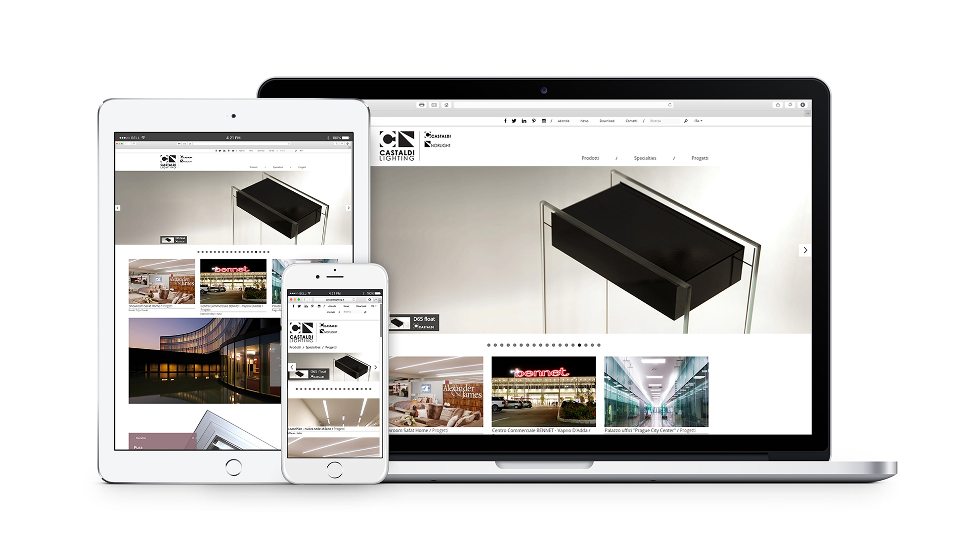
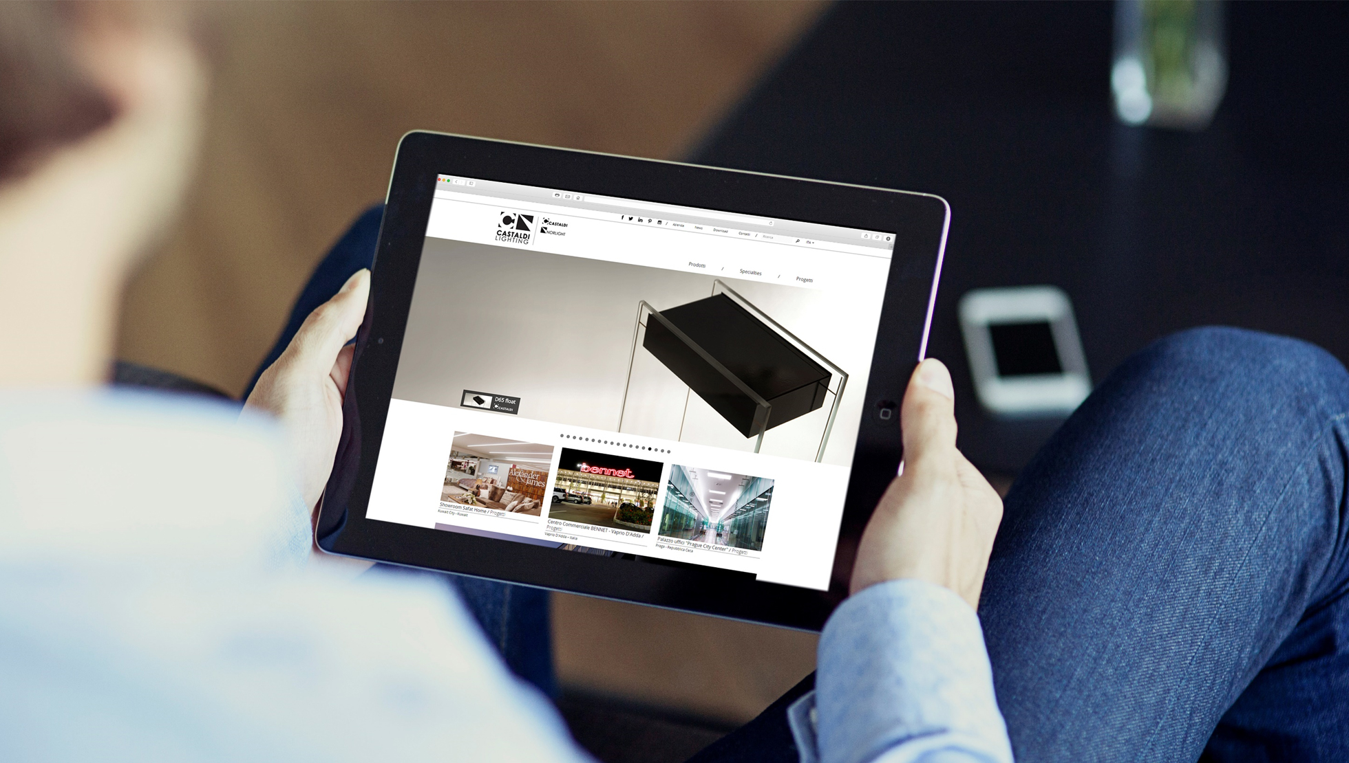
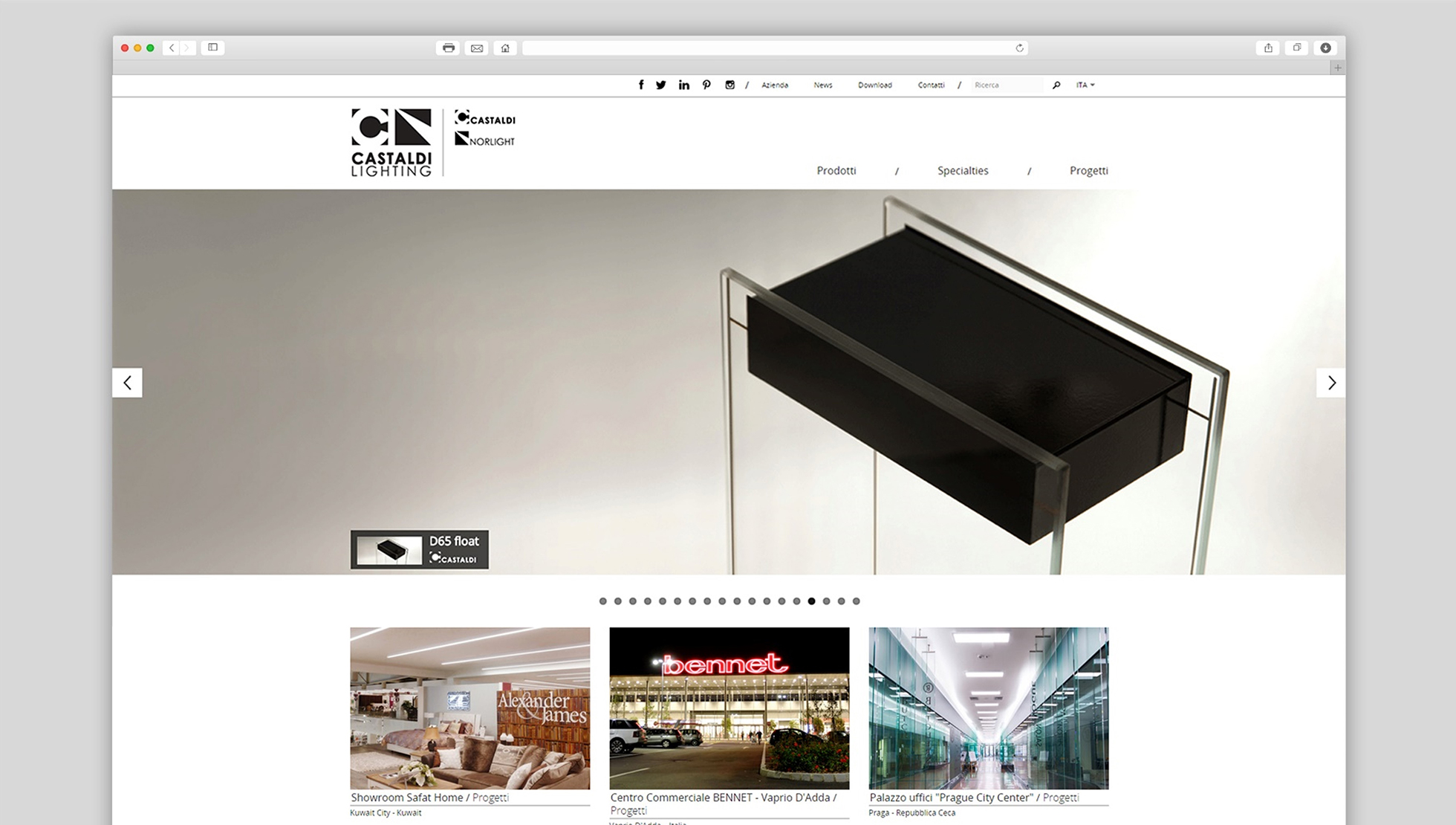
Branding, Website and Flyers
The rebranding of the new Castaldi Lighting group is founded on a revisitation of the brands of the two companies involved in the merger: Castaldi and Norlight. The procedure aimed to objectify the two pictograms to increase geometric clarity and power, and to reduce the symbolic value associated with an industrial past. The two geometric items merge to become a new symbolic sign and promote the new company’s merchandise.
The two basic colors chosen are complementary:
A dull moss green and a rich deep maroon. They represent the two industrial faces, Castaldi and Norlight, which make up the new group with a new image and productive attitude. The new shade of green is a variation of the traditional Castaldi colors, but remains closely aligned with its production of outdoor lighting. The maroon is a new take on the traditional shade of orange used by Norlight to standardize the target for the communication.
Development of corporate identity for Castaldi Lighting (logo, business cards, letterhead, press kit). The group includes two brands of lighting:
Castaldi and Norlight. The project underlines the value of the new brand, Castaldi Lighting, born from the merger of Castaldi and Norlight.